
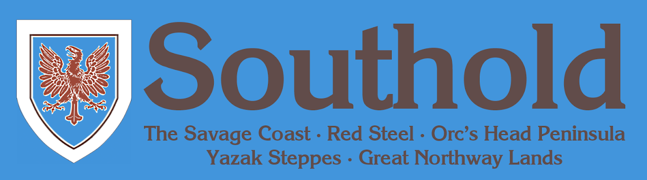
Southold logo
by Sionainn T. Mac InnéirgheFor the Savage Coast regionalization, I tap into the old forgotten SOUTHOLD label from the Master Set map.
There's quite a lot of conflicting conceptions of the boundaries of the Savage Coast and its subregions or hinterlands. The original X9 SC had two subregions:
1) East of the Orcs Head Peninsula
2) The Orcs Head Peninsula
Then there was the Bruce Heard era, which really brought the place to life, and changed the continuity so that X9 took place in the past.
Then, in the AD&D Red Steel boxed set and Odyssey Savage Coast downloads, the "Savage Coast" region got whittled down so that it explicitly didn't include the Orc's Head Peninsula or the Yazak Steppes. Though the Orc's Head Peninsula was part of the Savage Coast-branded product line, it was not part of the Savage Coast proper.
"Beyond the Savage Coast proper lie several lands. Inland from the coast is a vast expanse known as the Yazak Steppes. Hanging from the western end of the coast proper is the Orc's Head Peninsula, a land of dense jungles and savage inhabitants. While the Red Curse does not directly affect these lands, I believe part of the key to its origins can be found in these other lands, perhaps in the Great Northway, perhaps somewhere on the peninsula, perhaps beyond on the Arm of the Immortals. These areas warrant much study."
-SC Campaign Book, p.89
The name "Southold" doesn't have this baggage. Or any baggage...since it was hardly used at all. And the Mentzer map of Southold does include the OHP and Yazak Steppes, and most of the Great Northway. So I tap it to include all of those lands. Basically, it's a Rasmussen mega-setting.
This consolidated Southold would adjust the Mentzerian boundaries to follow the northern edge of the Yazak Steppes and Great Northway Lands.
***
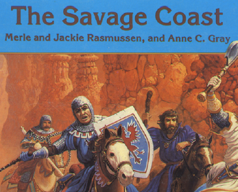
For the logo's aesthetic, I go back to the original X9: The Savage Coast (1985) by Merle and Jackie Rasmussen. I use the blue color and dark brown lettering from the cover and title.
The font is Korinth Serial Bold (freeware)
Those colors are tied into the blue, brown, and white colors of the Parkinson cover painting, which I believe depicts the Lawful Brotherhood. (Somebody correct me if I'm mistaken).
I take the most prominent shield in the painting as an iconic symbol of Southold.
I reconfigured the SOUTHOLD logo into two versions:
1) Without subtitles. I shifted the Lawful Brotherhood shield to the right side, so that it firmly accentuates the "-hold."
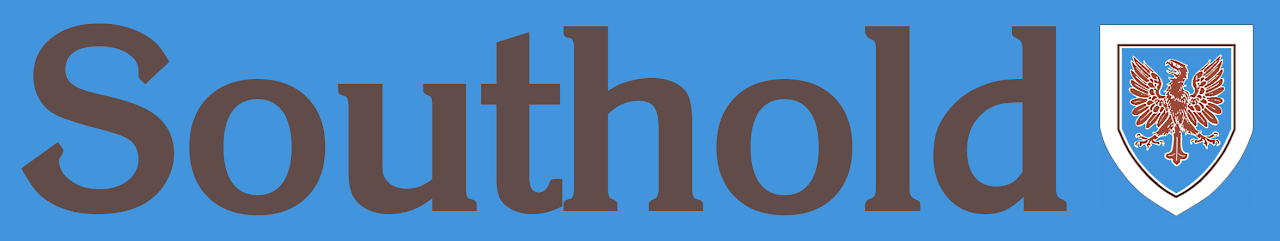
2) A version with all the sub-sub-setting logos! RS, SC, OHP...and Yazak Steppes and Great Northway. But, no logo for YS and GN exists, so I had to make them. :)

Yazak Steppes:
-The background for this logo is a screenshot of the grassy texture on the foldout Red Steel map.
-The font is Cochin Bold, as seen on the RS map. (thanks Thorf!)
-The color of the lettering is taken straight from that map's "Yazak Steppes" label.

Great Northway Lands:
-I cut and pasted the North-pointing compass rose from the Great Northway Lands map, from DUNGEON#6.
-The font is white Century Schoolbook on a black background, as seen in that same map.